


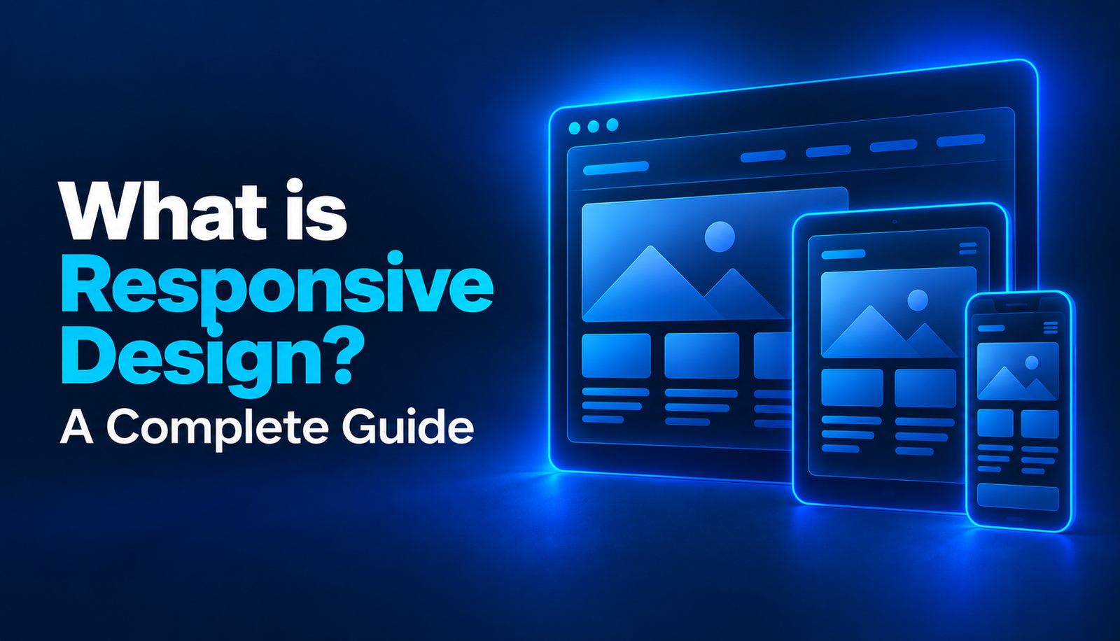

Responsive design refers to the ability of a website to remain usable across desktop, tablet, and mobile devices by adapting to different screen sizes. The goal is not simply to make the page smaller, but to ensure that content is presented in the right order and remains readable and easy to use on different screens.
Today, a significant portion of users access websites through mobile devices, which means responsive design is no longer an optional feature but a fundamental requirement. This is especially important for e-commerce websites, where users often browse products, compare options, and complete purchases directly from their phones.
For this reason, good responsive design should cover not only visual layout but also page speed, navigation, button sizes, form usability, and the overall purchasing flow.
What Is Responsive Design?
Responsive design is a web design approach that allows elements on a page to rearrange themselves according to screen width.
Two sections displayed side by side on desktop may be stacked vertically on mobile devices. Large navigation menus may be simplified for smaller screens. Images can resize according to screen width, while font sizes can be adjusted to remain readable on different devices.
The main purpose of responsive design is to create a flexible system rather than designing a separate version of the same website for every device.
With this approach, users can easily access content and complete essential actions regardless of the device they use.
Why Is Responsive Design Important?
Responsive design has a direct impact on user experience.
If users visit a website from a mobile device and need to zoom in to read text, struggle to tap buttons, or encounter a navigation menu that does not work properly, they may leave the website quickly.
This can affect not only user satisfaction but also conversion rates.
On service-based websites, contact forms, quote request buttons, and phone links should be easy to use on mobile devices. On e-commerce websites, product selection, variant selection, adding products to the cart, and checkout should be as simple as possible for mobile users.
Responsive design can also influence brand perception. A professional and consistent website can create a more trustworthy impression.
Why Is Responsive Design Important for SEO?
Responsive design is also important for SEO because search engines consider mobile user experience to be an important part of overall page quality.
A website that does not function properly on mobile devices may cause users to leave pages quickly. This can weaken the overall user experience and may indirectly affect organic performance.
When a responsive structure is used, the same content is served through the same URL across different devices. This reduces the need to create separate mobile and desktop pages and makes website management simpler.
In addition to mobile compatibility, page speed, image optimization, and content layout also influence SEO performance.
For this reason, responsive design should not be viewed only as adapting a layout to screen width. It should be treated as part of the entire mobile user experience.
Why Is Responsive Design Important for E-Commerce and Shopify Stores?
In e-commerce, mobile experience can directly affect sales performance.
When users land on a product page, they should be able to view product images easily, select variants, and reach the add-to-cart button quickly.
Even if a Shopify store uses a responsive theme, the real user experience still needs to be tested separately.
Some themes may technically be mobile-friendly but still provide an inefficient experience on smaller screens when it comes to product galleries, filtering, or cart functionality.
A significant portion of traffic from Meta Ads and social media campaigns comes from mobile devices. If the product page users reach from an ad does not perform well on mobile, advertising performance may also decline.
Responsive design is especially important in the following areas of a Shopify store:
- Displaying product images at the correct size
- Keeping the add-to-cart button easily accessible
- Making variant selections easy to use
- Ensuring collection filters work well on mobile
- Keeping the checkout flow simple
- Maintaining strong mobile page speed
For this reason, responsive design is not only a visual consideration but also an important part of e-commerce conversion performance.
Why Should Designs Be Responsive?
Users access websites from a wide variety of devices and screen sizes, which makes responsive design essential.
The same visitor may browse a website on their phone in the morning, use a tablet during the day, and complete a purchase from a desktop computer later.
The brand experience should remain as consistent as possible across all of these devices.
Without responsive design, users may be unable to access certain content, buttons may extend beyond the screen, or images may break the page layout.
These issues can be especially frustrating for mobile users and may cause them to leave the site.
Good responsive design rearranges content appropriately without making the differences between devices noticeable to the user.
What Are the Advantages of Responsive Design?
One of the biggest advantages of responsive design is that it provides a more consistent user experience across different devices.
Instead of managing separate systems for mobile and desktop, the design can be managed through a single structure.
This can also make maintenance and development processes easier.
Responsive design may provide several additional benefits:
- Improve the mobile user experience
- Make pages more readable across different screen sizes
- Simplify navigation
- Improve the usability of forms and buttons
- Support e-commerce conversion processes
- Contribute to mobile SEO performance
- Maintain visual consistency across the brand
- Reduce the need for separate websites for different devices
However, simply adapting technically to different screen widths is not enough for successful responsive design. User behavior should also be taken into consideration.
What Are the Principles of Responsive Design?
Responsive design is based on a flexible and scalable structure.
Page elements should be designed to adapt to different screens rather than relying only on fixed dimensions.
Images should resize according to screen width and should not overflow beyond the page.
Typography should remain readable across devices. Large headings that look ideal on desktop should not take up most of the screen on mobile.
Buttons and links should also be large enough to use comfortably on touchscreens.
Content prioritization is another important principle of responsive design. On mobile devices, the information and actions users need most should be placed as high on the page as possible.
Mobile-First Web Design
Mobile-first design is an approach where a website is designed for smaller screens first and then expanded for tablet and desktop.
This method can help reduce unnecessary elements.
Limited screen space forces designers to identify which content is truly important.
For example, on an e-commerce product page, the product image, price, variants, and add-to-cart button are usually the main priorities. Additional content can be displayed more extensively on desktop, but the purchasing flow should come first on mobile.
A mobile-first approach can also be beneficial for performance. Reducing unnecessary heavy elements may support faster page load times.
How Is Responsive Design Created?
When creating responsive design, the first step is to plan how the website should behave at different screen widths.
Instead of simply shrinking the desktop layout, content priorities should be defined separately for each screen size.
Flexible grid systems should be used, and element widths should be able to adjust according to available screen space.
CSS media queries allow different layout rules to be applied at specific screen widths.
Images should be prepared responsively, and unnecessarily large files should not be loaded on smaller devices.
Navigation can be simplified for mobile devices. Large mega menus can be converted into dropdown or accordion-style navigation.
Form fields can be arranged in a single column and sized appropriately so users can enter information comfortably.
After the design is completed, testing on real devices is important. Mobile previews inside a browser may not reveal every usability problem.
Responsive Design Tips and Best Practices
Responsive design should not focus only on visual consistency.
One of the first areas to check is mobile page speed. Large images and unnecessary scripts can slow down pages on mobile connections.
Navigation should remain simple. Users should be able to reach the page they are looking for within just a few taps.
Buttons should not be positioned too close together, and enough space should be provided for comfortable touch interaction.
Forms should avoid unnecessary fields. Especially in quote request forms and checkout processes, users should only be asked for information that is genuinely required.
Other important responsive design best practices include:
- Keeping text sizes readable on mobile devices
- Preventing images from overflowing beyond the screen
- Eliminating horizontal scrolling
- Limiting the use of popups on mobile
- Ensuring sticky elements do not cover too much of the screen
- Optimizing product filters for mobile
- Keeping CTA buttons easily accessible
- Testing navigation and checkout flows across different devices
After responsive design is implemented, user behavior should also be analyzed. If mobile users leave a particular page at a high rate, this may indicate a design or usability issue.
Build a Responsive Shopify Store with ROI Digital
Making a Shopify store mobile-friendly involves more than simply choosing a responsive theme.
Product pages, collections, filters, menus, and the purchasing flow should all be designed according to real user behavior.
With ROI Digital’s Shopify design service, desktop and mobile experiences are evaluated together.
The theme structure, product pages, mobile navigation, cart process, and performance factors are reviewed in line with e-commerce conversion goals.
Especially when traffic is being driven to the store through Google Ads and Meta Ads, mobile experience can directly affect return on advertising investment.
To build a fast, simple, and user-focused Shopify store or improve the mobile experience of your existing store, you can visit the ROI Digital Shopify Design page.